RGB, CMYK and Pantone Colour Systems: What are They and Which One Do You Need?
When ordering corporate gifts, you might have been asked to supply your artwork in a vectored format or asked to provide a PMS reference - that left you scratching your head and wondering why we can't simply make it up from the files you've aldery given us. When it comes to pronting, one colour in to always all it seems and representing shades accurately is important both to you and us, to make sure your brand is consistent throughout. RGB, CMYK and Pantone - each of these terms refers to a colour system that is used in printing or displaying artwork and logos, either on screen, on corporate gifts or other branded materials.
Whilst you don't need to understand how these colour systems work in precise detail, it can help you to feel more confident when specific format is required to brand your goods and what is involved in determining it. We've prepared this guide, to help make the process of ordering your gifts as stress-free and easy for you as possible.
RGB
RGB is the acronym for Red, Green, Blue. Light in these three colours is combined on screens to display an array of shades on computer monitors, tablets and mobile phones. Because light, specific device settings and hardware play such a big role in creating RGB colours, they can look different on different screens, depending on screen brightness and light conditions in the room.
To define colours, web and grephic designers specify the amount of each of the primary three colours. The values used range from 0 to 255. 255 of each colour gives pure white and 0 of each colour gives black. The same values can also be represented with six-digit, alphanumeric codes preceeded with a # - they are called hex codes and are used widely in web design.
We can't print promotional gifts using the RGB system because these colours represent light, not ink; however, if you only have your design in a digital format, we can convert it to another system, and ensure that colours match as closely as possible because of screen variations, though, some mismatch might occur.
 RGB colour mode is made up of light and is only visible on screen.
CMYK
CMYK stands for Cyan (a light blue colour), Magenta (bright pink-red), Yellow and Black. These are ink colours that form the basis of CMYK printing, also referred to as 4 colour, full-color or process printing. In order to create different hues, the four colours are printed in very tiny dots, which are then blended by the human eye and seen as one shade or smooth gradient. CMYK files are also used in dye-sublimation printing.
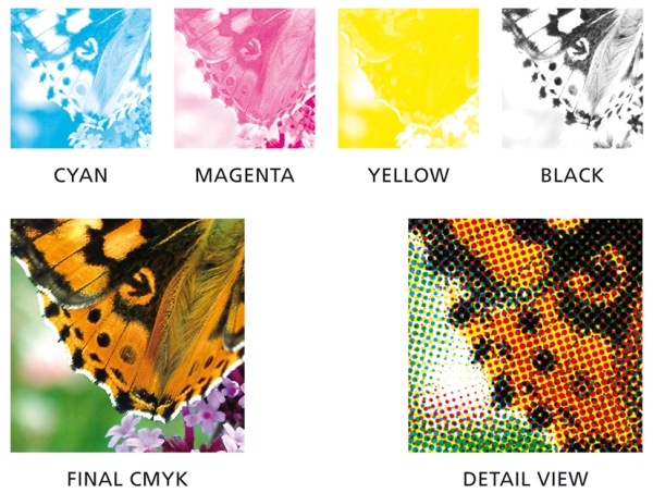 CMYK printed images are made up of little dots in the four colours: byan, magenta, yellow abd black, to create the finished image
These days process printing is applied to more and more products and materials, including plastics, paper, fabrics and ceramics. It is cost effective and fast, with very little set up involved. This is because the printing machine is always filled with the same four colours, so there's no need to wash ink residue in between jobs.
CMYK is often used to print images with gradients or photographic images. In order to print effectively using CMYK the image has to be high resolution - 300 DPI (dots per inch) and the same size or bigger than the print area. We adjust the layout according to the item.
Note, however, that when an RGB image is converted to CMYK, there might be colour variation. This is because there are limitation to the four colour ink blend, compared to light. To avoid stark differences betwen what you see on the screen and in print, it's important to convert the image from RBG to CMYK, using software like Photoshop. That way, and using latest printing techniques, we are able to also include vivid colours in print.
All these items required high resolution files saved in CMYK colour mode
Pantone
While CMYK is a cost effective and fast way of printing photographic images, it's not right for every print job. When companies want to ensure brand colour consistency and are printing areas of solid, block colour, CMYK may not offer the perfect colour match and uniformity.
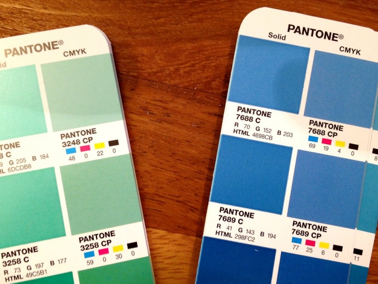
Pantone is a corporation that came up with a way of achieving uniformity when producing and printing colour: Pantone Matching System, or PMS for short. Rather than combining 4 colours in each print job, the machine is filled with single pre-defined colour that matches company colours exactly. Each colour has to be applied onto the product separately and the machine needs to be washed between filling it with each colour.
Pantone colours are determined by graphic designers when they initially create a company's brand identity. Selected colours have unique code that specifies the shade. These codes are called Pantone colours, or PMS references.
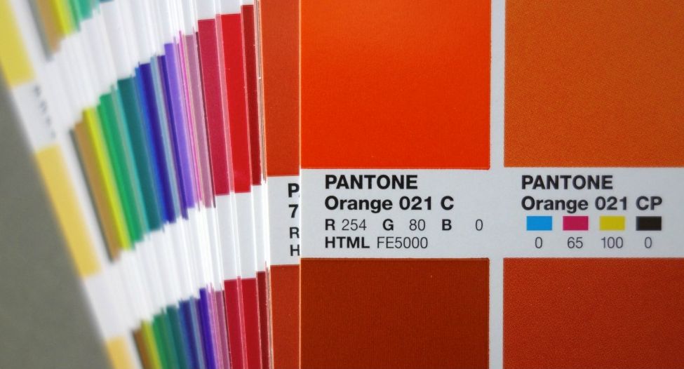 The Pantone system assigns an individual number to every colour. The corporatetion proide books that show each colour and how to recreate it on screen and in CMYK printing
Most corporate colours can be identified as a number from the Pantone system. It can achieve the most accurate colour match, but is mostly used for printing just one or two colours at a time, without gradients. This method is the best for ensuring your colours match across all products.
The vast majority of our products can be printed with Pantone colours. In order to use this method, save your file as a vectored image before you send it to us, or we can convert your image for you at a small fee. Pantone references are not saved in the file, they have to be provided to us as a separate piece of information and can usually be found in your corporate branding guidelines book.
 These items required vectored files and PMS references to print
Key Points to Keep in Mind
- RGB colours are only relevant for screen and cannot be printed
- CMYK colour mode is best for photographic images and artwork that has gradients. These images should be saved as a high resolution JPG or PDF file
- For printing spot colour in your logo, best colour match is achieved when you supply us with Pantone references. Files need to be supplied in a vectored format - usually with extensions .AI, .EPS or .PDF
- Ask us. We know that this is a lot of information to take in, and if you're still confused, don't worry! Let us know your concerns or questions and we will be more than happy to explain things at any stage of the ordering process.
 Promotional materials look more professional when all colours are precisely matched
If you would like to take a look at the some of our corporate gifts that can be printed using these systems, please visit our website. Or, if you have any questions for us, do give us a ring on 01204 577 995.
Get Free Weekly Email Updates
- Branding and Product Tips
- Case Studies
- New Product Alerts


Talk to Us
»
01204 577 995
info@UKCorporateGifts.co.uk